Winnipeg Jets: NHL Jersey Re-Design
By admin
Posted in - Hockey on February 17th, 2021
Winnipeg Jets: Brand / Jersey Design History
My Winnipeg Jets concept jersey set is among my favourites that I have personally created. It has evolved significantly over time, including previously using a few different fan-made concept logos, but the final result is, in my opinion, a significant upgrade on anything that either instance of the franchise has ever actually worn.
My opinion on the Winnipeg Jets brand is sure to be controversial – I actually believe that the Jets have never once had a truly good logo or jersey. Starting with the logo, the old Jets (now Arizona Coyotes) always relied on a large wordmark that was never stylized all that much.
After the move of the Atlanta Thrashers to Winnipeg, the logo finally abandoned the wordmark element, but now it centers on a flat silver jet with just enough detail to look as though it is not detailed enough, awkwardly slapped on top of a red maple leaf, introducing a colour that is not even used in the jersey designs.
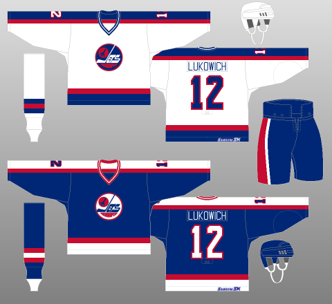
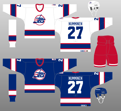
Finally, the jerseys: originally, the colours were royal blue, red and white, the most over-used colour scheme in the NHL, at the time they joined the NHL (1979), and continuing on today. Their original owner came from the New York Rangers organization and decided to re-use an old (very unpopular) jersey design for the Jets, as well as their colours.
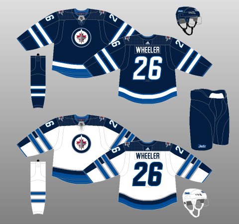
In 1990, the team re-designed its jersey set and logo to move slightly away from the Rangers design, but kept the same colours and another standard jersey design. After the team moved to Phoenix in 1996, it took until 2011 for a new Winnipeg Jets team to return, and when they did, they introduced the new roundel logo and a very different jersey design and colour scheme to start the team off with.
The colours seem to be inspired by the navy and powder blue colours of the team they were originally. Unfortunately, the jersey design is awkward, because it not only featured the logo with a red maple leaf despite no red in the jerseys, but also has the strange aesthetic on the white jersey of vertical and horizontal stripes meeting and the latter wrapping over the former.
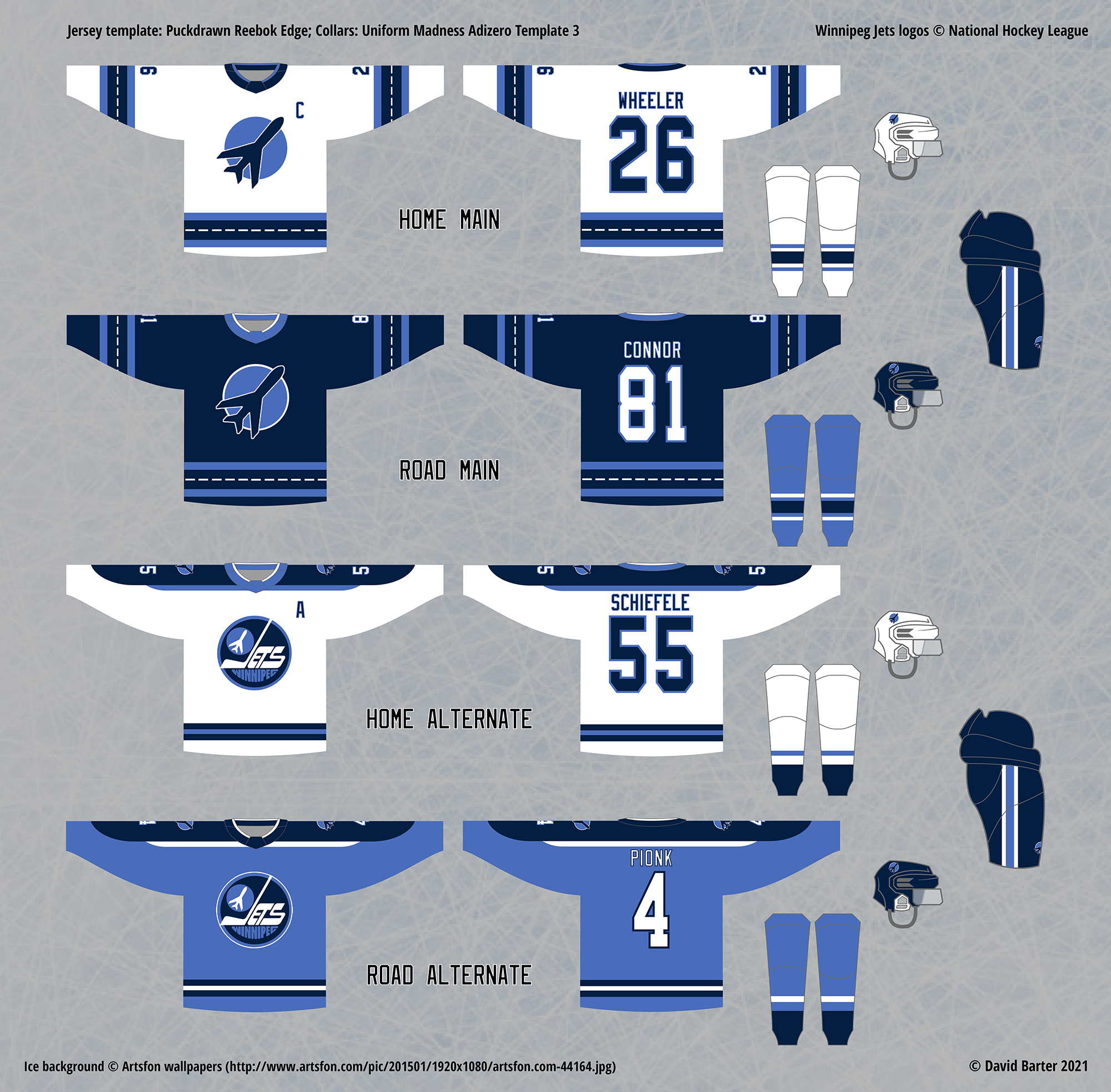
Initial Home, Road and Alternate Jersey Re-design
When I started my Jets concepts, I had three main goals: find (or make) a better logo than any of the previous ones, introduce a more unique colour scheme that did not stray totally away from what came before, and make the jerseys’ striping designs more distinct from other teams.
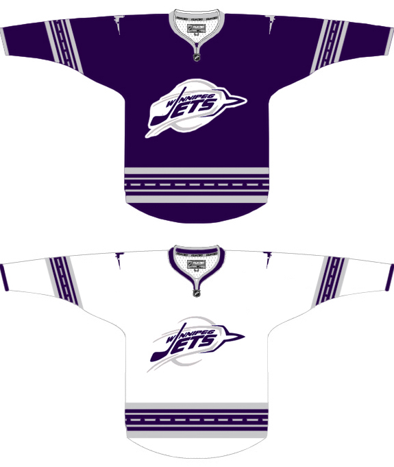
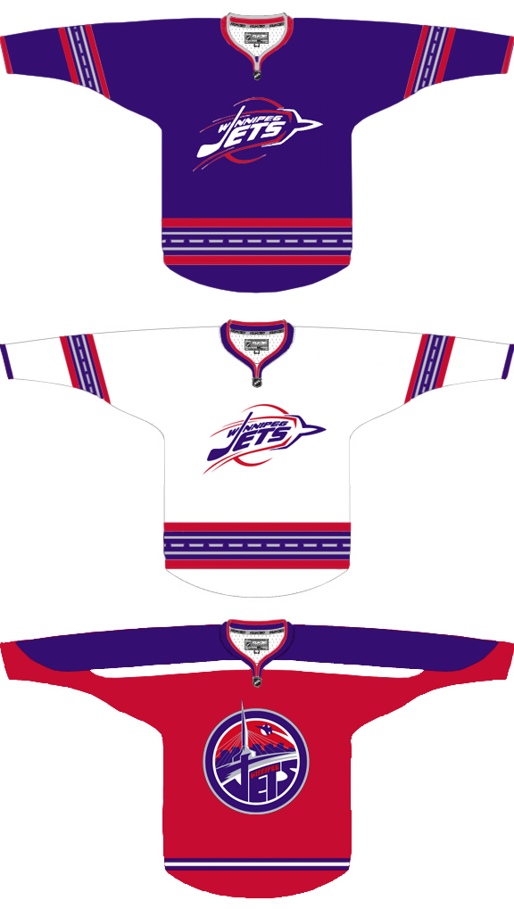
Since I am always looking for opportunities to use under-represented colours, I immediately experimented with purple, since it seemed similar enough to blue/navy to retain a “Jets” identity, but still stood out from other teams using blue/navy, red and white. I started with a very dark shade of purple and combined it with silver, before moving on to a lighter purple and red, very much resembling the Jets of old.
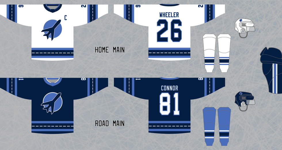
The design of the jerseys have had one representative unique element from almost the very beginning: runway stripes. I came up with the idea by thinking about how the jersey striping scheme could connect to the general idea of aviation, and it occurred to me to use a broken up white line over the dark purple/navy/blue to look like a runway that a jet might land on at an airport. Just like many 90’s designs that push the limits of what a “traditional” hockey jersey could look like, with creative elements built within straight-line stripes, this idea seemed very promising to me.
When it came time to design the alternate jersey, I again tried innovating the elements of a hockey jersey with the concept of aviation: this time, I created a shoulder yoke that looks like aircraft wings (not a jet, but I was not picky here) viewed from a near-horizontal angle. As a bonus, this look also was reminiscent of the original Jets jerseys from 1979, with an opposing-coloured shoulder stripe that extends from shoulder to (almost) wrist.
My final designs took yet another turn: first, I eventually grew tired of the logo options I had been using, which were all still reliant on wordmarks. Just for fun, one day I pulled the silhouetted jet in front of the red circle in their original logo and put it on a jersey by itself, thinking it might give the design a simpler look.
I cannot explain exactly why this looks so much better to me than the current Jets logo, which I criticized for being too “flat”. I believe it’s because as a silhouette, there is no expectation for detail on the jet, but the current logo creates that expectation by closer resembling a real jet. In the end, I acknowledge that it is a bit of a contradiction, but this jet-silhouette logo seemed like the perfect logo to me, despite its lack of design elements, and I have stuck with it ever since.
As for the colours, that was a very recent change – I experimented with three colour schemes (purple + red, navy + red and navy + Thrashers powder blue), and upon seeing my design in all three schemes, I found myself preferring the Thrashers-inspired colours, which also gave the final identity an element of incorporating this new franchise’s past, which is an appealing factor to me. This is actually not the current Jets colour scheme, as they changed the lighter blue to be significantly darker in their new brand.
Finally, for the alternate jersey set, I opted for the Jets’ original logo with the colours changed to match. This was admittedly my settling, as there were no good options that did not have a prominent wordmark, and I was out of ideas for how to change that. I could have used the primary logo on all four jerseys, but I prefer not to do that if possible. As a bonus, since the jersey design resembles the original Jets jerseys with a creative twist, placing the logo from those jerseys on them completes that aesthetic very nicely.
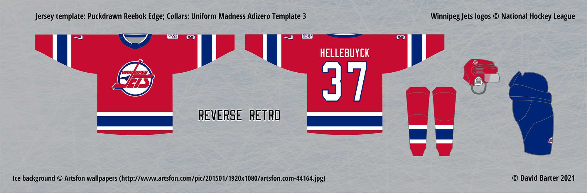
I mentioned how I believe that the Jets (current and past) have never had a truly good logo or jersey, so obviously my options for a Reverse Retro were limited, since the idea is you have to use an exact design from the past, only with colours and/or logos swapped. The new Jets have used past design on a few occasions before, in Heritage Classic outdoor games, so the well for ideas was a bit dry. Just like their first two designs, in 1979 and 1990, these jerseys are very nice, but lack a distinct identity, as they look so similar to the New York Rangers.
However, one thing that the Rangers have never done is had a jersey that is primarily red, and so I used that idea, and applied it to the 1990 era Jets jersey which, though I stop short of calling it “good”, it is a jersey I have some nostalgia for, having started watching hockey as a kid in the early 90s.
The result is a truly “reversed” retro jersey – the pants, socks, and even the colours of the logo have had the blue and red switched, in order to balance the colours the same way as the original (the outline of the logo was originally red, which would have blended in with a red body colour, so I swapped the colours of the logo as well).
This is, in my opinion, a much better outcome that the Jets’ actual Reverse Retro jersey, which inexplicably uses the 1979 design, but replaces the white body colour with a dark grey that blends in with the navy shoulder stripes.
 Winnipeg Jets concept logo (left) by SyPhi Creations, alternate concept logo (right) by Johnny VonGriz