Arizona Coyotes: NHL Jersey Re-design

By Posted in - Hockey on February 16th, 2021 0 Comments
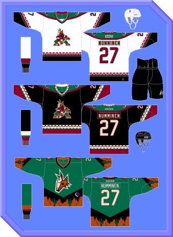
Arizona Coyotes: Brand / Jersey Design History
The Coyotes are one of several teams that for a long time has screamed “We could have lots of personality to our brand, but won’t let ourselves”. One of several teams that embraced a very nice 90’s aesthetic in their original jersey designs, but backpedaled in the 2000s because of a perceived “goofiness” to the design that was never really there – it was spurred on (at least in terms of perception) by brand traditionalists that reacted negatively to any deviation from the established norms of jersey design that were in place before the 90s.
Personally, I believe that there are plenty of traditions to hockey jersey design aesthetics that, if deviated from, make it almost impossible for the jerseys to look good, but designs like the Coyotes, Might Ducks and Hurricanes that were introduced in the 90s are not guilty of this.
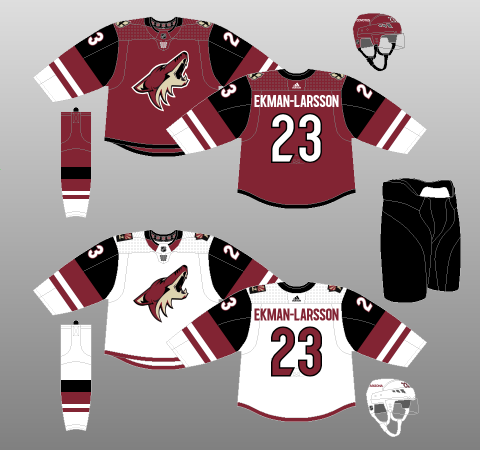
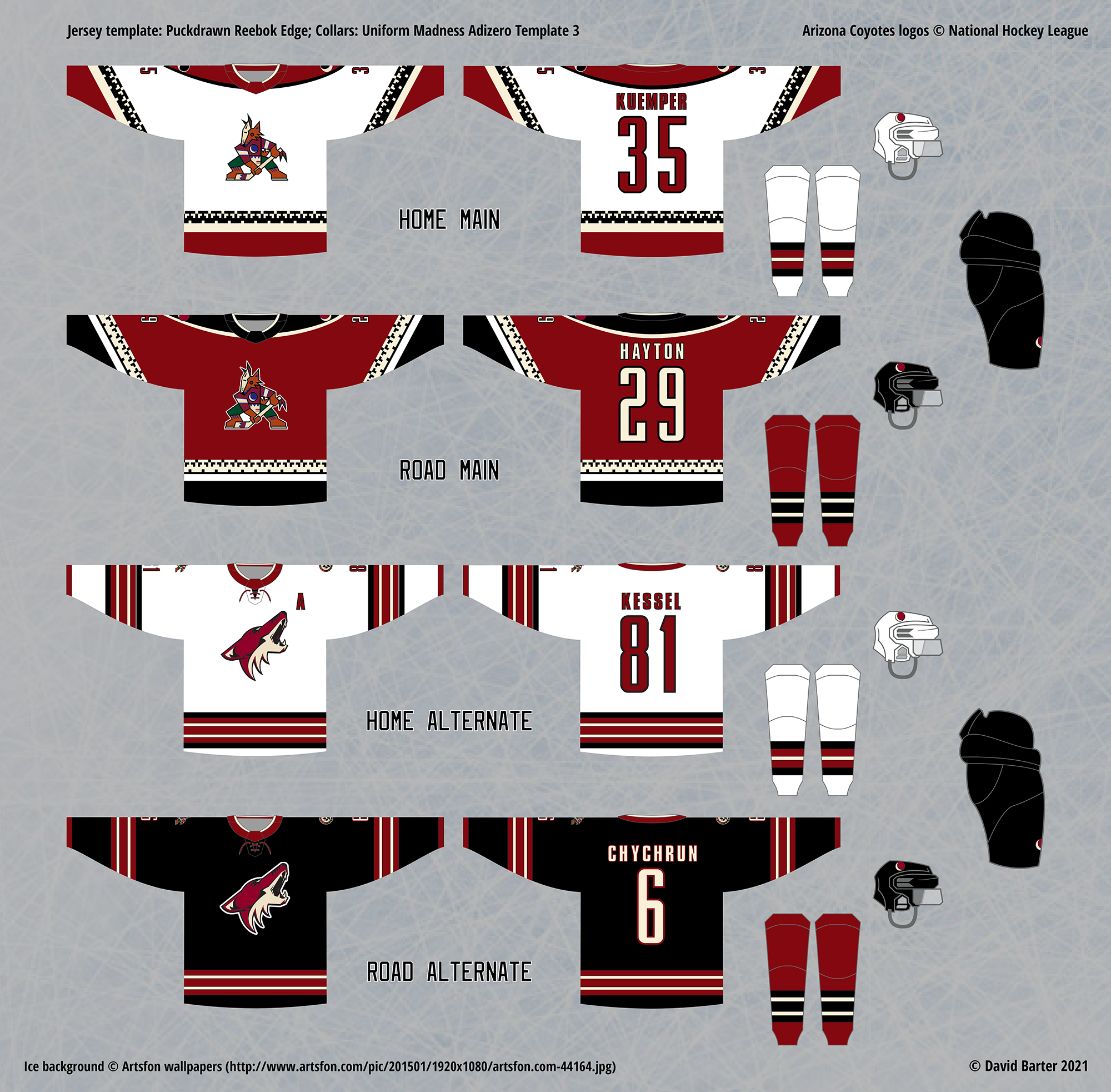
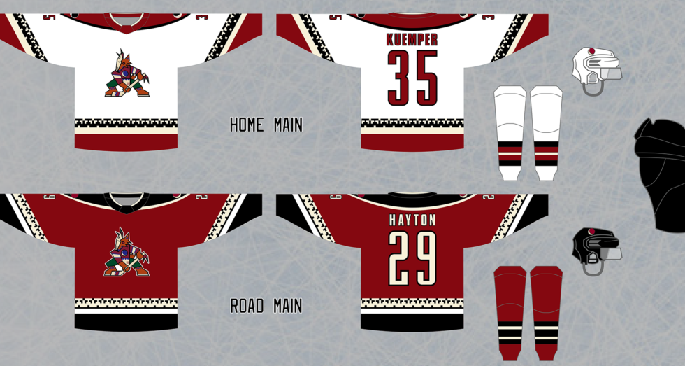
Initial Home, Road and Alternate Jersey Re-design

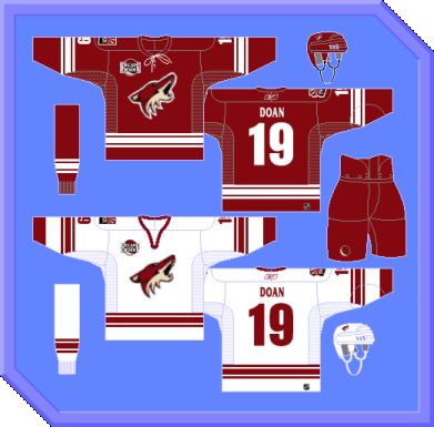
My early Coyotes re-design concept, with old RBK Edge Photoshop template

The original Coyotes design is referred to as the “Kachina” – named after the unique pattern used in the striping that has Indigenous roots in Arizona, and it gives a distinct “Arizona” feel to the jerseys that makes them positively stand out from other designs. For that reason, my goal with my Coyotes re-design has always been to bring this general pattern back.
I started out with a direct imitation of the original style and colours, but I preferred to make the base colour of the road jersey green instead of black. This is because the black body colour and green shoulder yokes are similar enough in hue and luminosity that they blend together, especially at a distance, and on broadcast distances on screens. Making the body colour green and shoulder yokes black instead improve this problem, as the larger amount of green help it to stand out.
I stuck with this idea for the main set for many years, and added a third jersey that used the Coyotes’ rebranded design from the mid-2000s, but modified it to include more black, since that looks better and incorporates all three main colours from that era (brick red, black and “sand”), instead of leaving one out for the sake of a “clean” and simpler design.
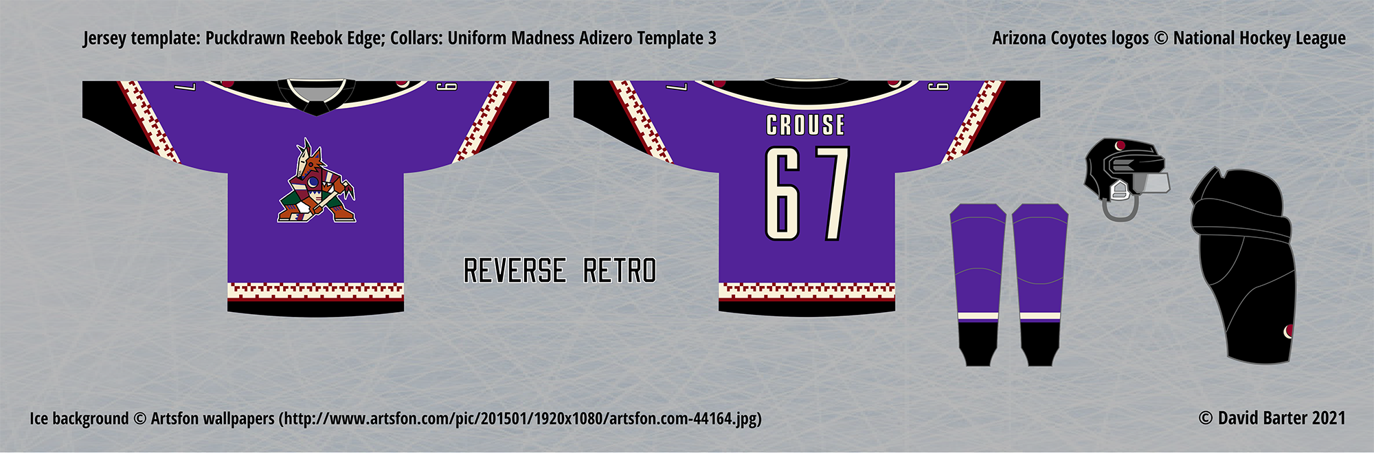
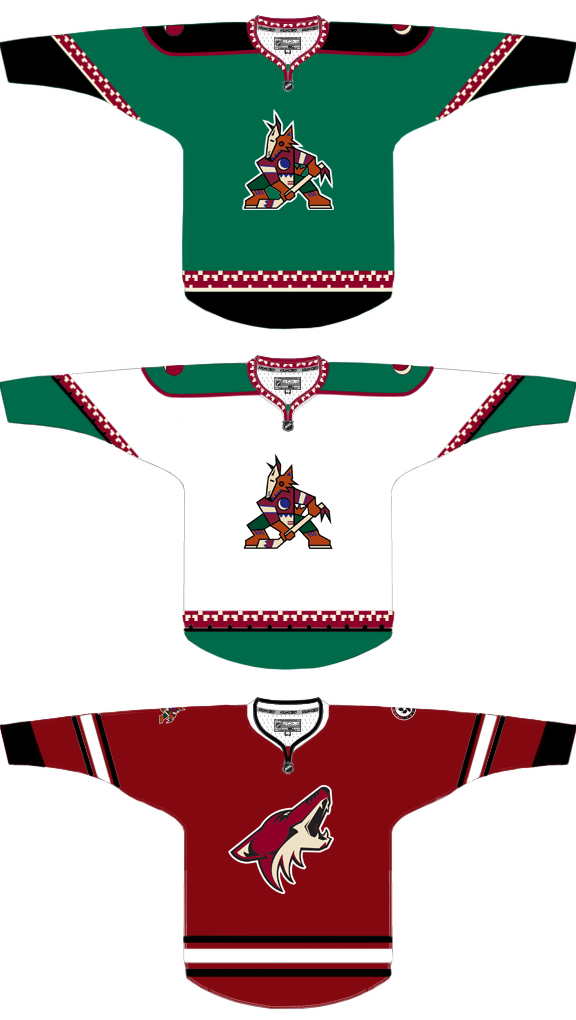
Reverse Retro Jersey Design & Resulting Changes

Actual Coyotes Reverse Retro jersey
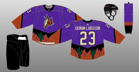
When the NHL released its Reverse Retro jersey program, I was inspired by the idea, which I still believe is appealing and purposeful, but I was disappointed by most of the actual jersey designs. The Coyotes decided to bring back their first alternate jersey, which was used during the Kachina era – it features a green body colour and… cartoon desert landscape on the waist.
For some reason, instead of firing this jersey into the sun, they “reversed” it by changing the green body colour to the purple found in the Kachina era logo and secondary crescent moon logo. This colour is excellent, reminiscent of a twilight/night sky in the desert, but its use is mired by the terrible, cartoonish design of the actual jersey.
When I set about designing my own Reverse Retro for the Coyotes, I was still using the green and black Kachina design, and combined with the lack of appeal of any other jersey design the Coyotes have ever used (in my opinion), I decided to try doing a different take on the Kachina jersey, so I remade it using just the brick red, black and sand colour scheme of the 2000s era, rather than including the green. This is a different approach than usual for my jersey designs, as I normally prefer a diversity of colours, rather than sticking to more conventional ones, such as red, black, blue and white.

Final Designs
In the end, when I made the brick red and black Kachina design, I realized that this was actually better than the original, with an improvement in how well the body colour stands out from the shoulder yoke, and an overall much cleaner design that still has the Kachina’s personality. I was so impressed by this design, that I actually decided to change the main home and road designs to match this one, and change the Reverse Retro later on.
Once I did that, I also decided to change the alternate set, since I normally do not like to have the same base colour of the road jerseys between the main and alternate set, and my alternate road jersey was brick red as well. I made the simple choice of switching the alternate road body colour to black, which leaves it a sleek and muted look, suitably balanced with the more “outlandish” main set.
After making these changes, I finished off my Coyotes collection by returning to the Reverse Retro jersey, and deciding to take advantage of the impressive purple shade of the actual Reverse Retro jersey, I made that colour the base of another Kachina design. Hopefully this combination of purple and black would not be too difficult to distinguish at a distance or on screens.

Comments are closed.