New York Islanders: NHL Jersey Re-Design
By admin
Posted in - Hockey on February 23rd, 2021
New York Islanders: Brand / Jersey Design History
Now here is a fun team with which to discuss jersey history and branding! The New York Islanders, in my opinion, have suffered more than any other team in the NHL in their ventures to be more “modern” and “different” in their team’s look over the years. This is because literally every single time they have changed their main jersey designs (and logo in one unfortunate case) away from their originals or introduced an alternate uniform, the results have been terrible (again, in my opinion).
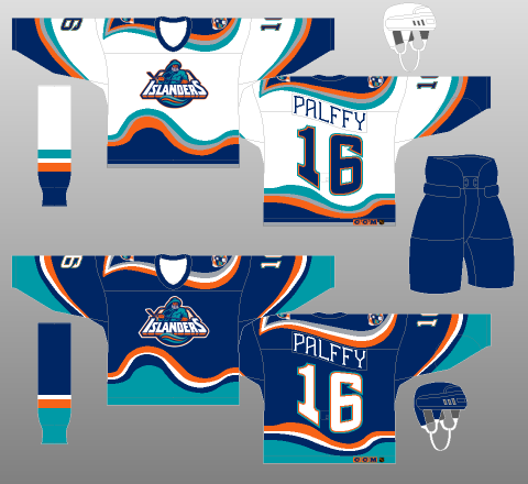
Let us begin with the 1995-96 rebrand, seen in the second image from the left above. This was one of the most infamous “ugly 90s” jersey sets, alongside the first set of third jerseys introduced that season. The Islanders changed their main set instead, to what is commonly referred to as the “fishsticks” or “Captain Highliner” jerseys. It changes the main Islanders jersey colour to navy from royal blue, adds the patently ridiculous wavy striping pattern, wavy names and numbers (!!!) and blocks of teal meant to remind you of actual waves.
The logo is equally awful: huge, tilted faux-3D block wordmark “ISLANDERS”, more wavy stripes at the bottom, surly fisherman gritting his teeth (have to look tough, it’s the 90s!), huge net in the background, all at a weird, upwards-tilted angle. While the original (and now current once more) Islanders logo gets plenty of criticism (it is a very basic design with large wordmarks, so not really among my favourites), it is so much better than this logo that it got switched for “Captain Highliner” on this design after just one season.
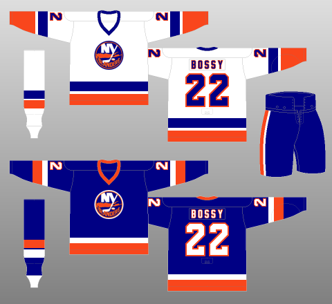
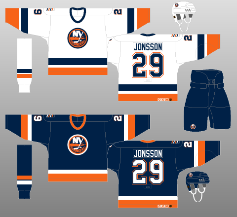
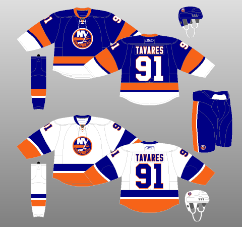
Starting in the 1998-99 season, the Islanders switched back to their previous design, but retained navy as the main colour. It was such a huge improvement over the “fishsticks”, no one really complained about this, including me, though if I may – I generally hate navy as a main jersey colour, it looks too close to black, especially on screens, and black obviously lacks colour, so it does not usually inspire me much.
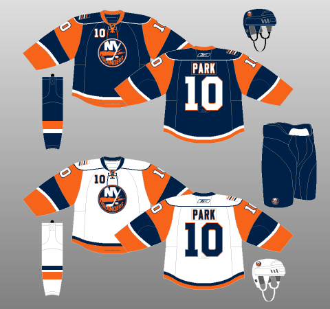
After sticking to this design (adding in a horrible orange alternate jersey with weird, pointy vertical stripes), when the Reebok Edge rebrand arrived in 2007, the Islanders again tried to re-invent the wheel, and we got the design on the bottom left above, which I have heard is called the “goldfish” jerseys, because of the look of those sleeves (that is fair). Along with that odd choice, they also were one of several teams to go with the classic (sarcasm) “shoulder yoke line with no colour filling it” design that the Edge designs loved so much: another disaster.
Thankfully, after just three seasons of this design, the club had introduced an alternate jersey that was the actual original royal blue design from their inaugural season, and that design was so popular, it had replaced the “goldfish” as the main set (with a white road version) by that time. Since then, the Islanders have stuck to this design (and continued introducing a variety of horrible alternates that constantly disobey every rule of good jersey design I can think of), which is still not perfect, but it is a good enough look, and I do not trust them to change anything ever again and come out with anything good at all.
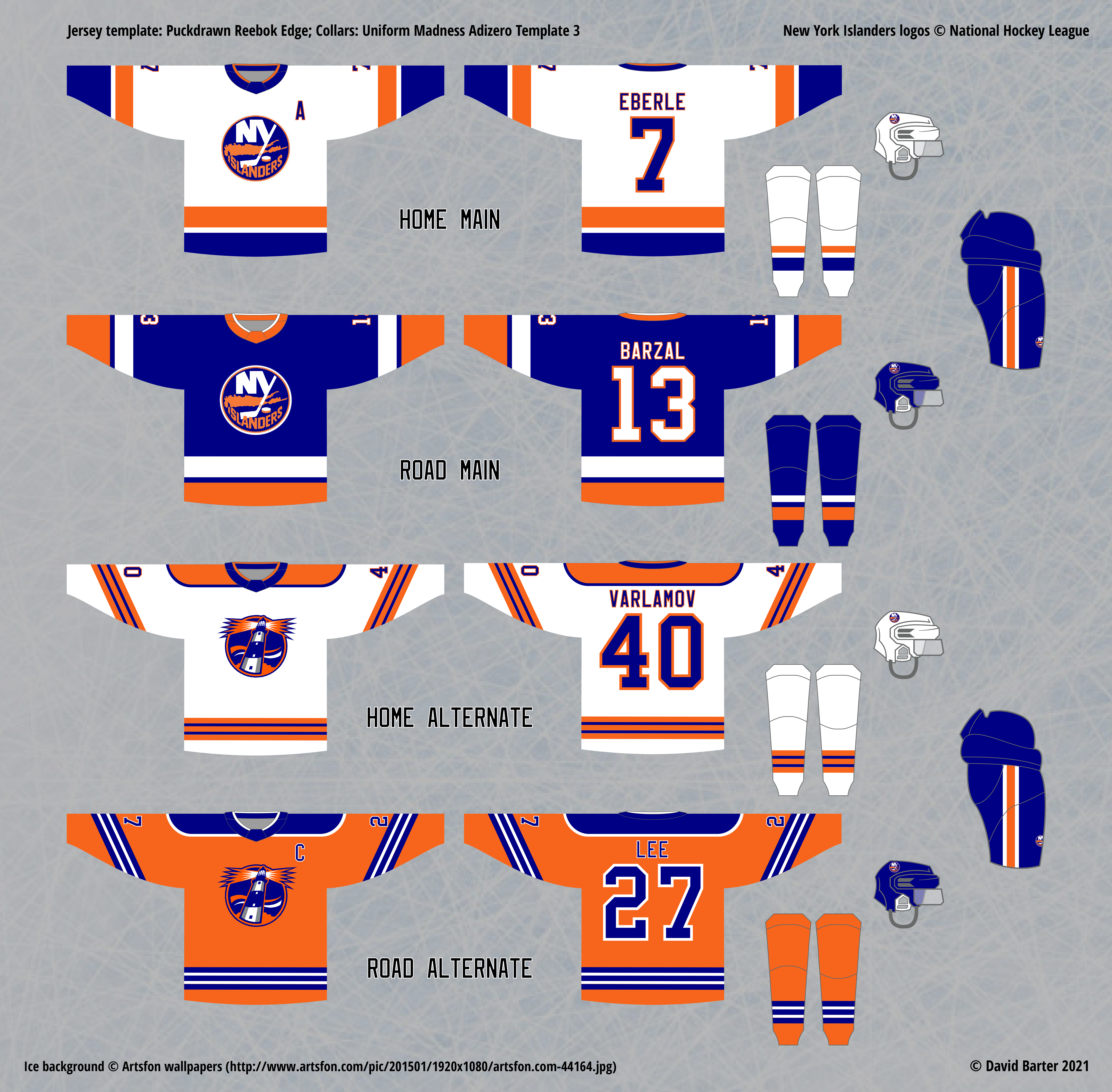
Initial Home, Road and Alternate Jersey Re-design
Much like how I wish the Islanders had stopped trying to re-invent the wheel when it comes to their jersey and logo designs, I decided not to get too creative with this concept – the main set is exactly the same as their retro main set from 2010, and I came up with the idea of using a few elements from past re-designs and alternates for my alternate design, but make it look as good as possible. I like to vary the main colour of the alternates whenever possible, and I hate navy, like I said before, so I knew it would have to be an orange alternate to satisfy me.
One underrated aspects of the “fishstick” era was the secondary “lighthouse” logo that was designed for the shoulders. I took a look at this design, and tweaked it by removing all the teal surrounding the wavy stripes in the background. This gave the logo a more traditional and fairly classy look, so I decided to put that logo on the front of the jersey, and have stuck with it ever since. As for the stripes, I obviously did not want to make them wavy like the original “fishstick” design, but I figured making them reminiscent of waves could work, and so the alternating blue-white-blue-white-blue pattern emerged, which really fits this look well.
As the years went by, the only changes I felt that I needed to make to this set, aside from adding the home alternate, was playing with the colour balance of the stripes on the main set. I have a soft rule for my jersey designs – teams should have a main colour (body of Road Main) and a secondary colour (“accent” if you will), and that colour should be the second-most prominent colour on the Road Main jersey, and the third after white and the main colour on the Home Main jersey.
That may not seem like a detail that needs pointing out, but many teams’ white jerseys (road in the real NHL) disobey this rule by having the main colour (again, body colour of the “home” jersey in the real NHL, Road Main for me) diminish into the third most prominent colour on the white jerseys, or even disappear almost entirely (see the current Oilers and Blackhawks main sets for examples of this, and the Predators current designs for an example of a team that averts this).
The traditional Islanders design, which I had always based my main designs on, is also an example of this, because the white jersey makes orange the second most prominent colour on the white jersey by occupying the larger sleeve position, while the royal blue is diminished by just being a thinner stripe above that. The original royal blue jersey also makes what is in my opinion, a mistake: it makes white the second most prominent colour on a non-white jersey, by having the sleeve stripe be white, instead of orange.
So, for my final design, I decided to fix that by swapping the royal blue and orange stripes on my version of both jerseys for better colour balance according to my rule. This jersey design is not the worst example of this problem, but it was a simple fix, so I decided to go for it.
My rule on colour balance is also reflected in how I designed the Home Alternate: I could have kept the royal blue elements where they are in the Road Alternate, and simply swapped white for orange, but I preferred to reflect the fact that orange is the main colour for the alternate sets instead. To be fair, I do not always obey this rule, since sometimes it is not possible for a jersey design to look “right” when it is applied in certain instances, which I will point out when we get to an example of that.
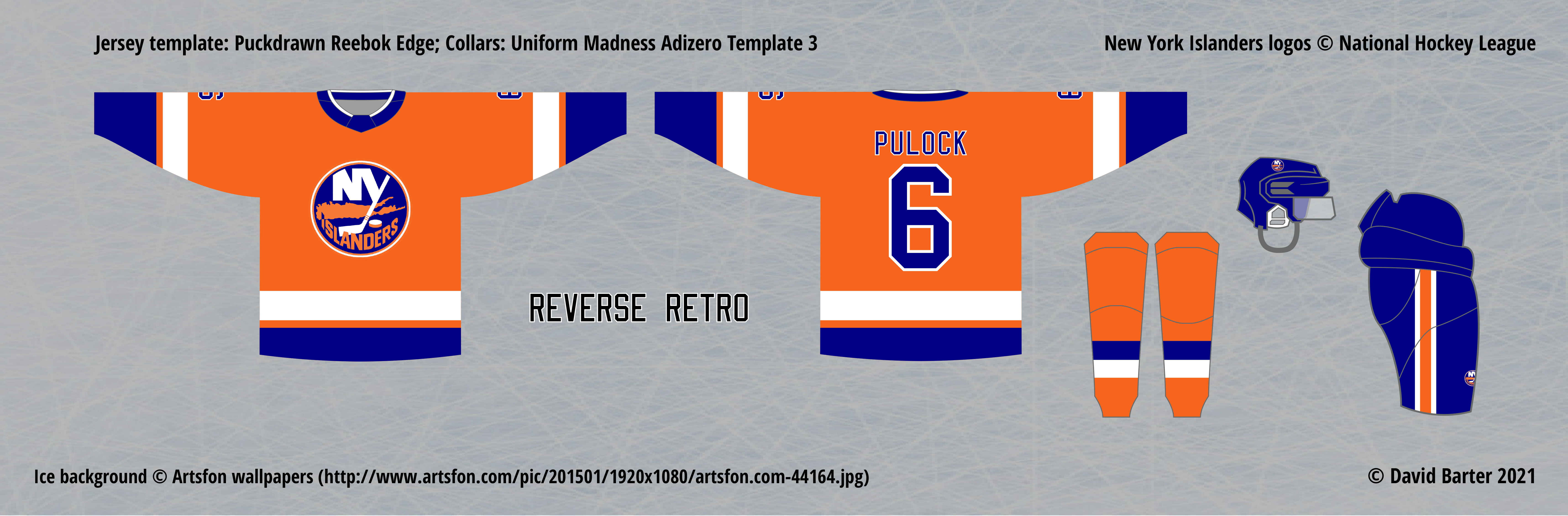
For the Reverse Retro, nothing too complicated here. Obviously, I did not want to imitate any of the Islanders’ past alternates or other designs that strayed from their consistent brand, so I simply reversed their original road jersey to be orange instead of royal blue, which is a pretty nice look.
The Islanders’ actual Reverse Retro jersey is obviously not ideal – it looks nice as well, but again, I am not a fan of the navy as a body colour. But, I appreciate how this jersey does the same thing I did with the Road Main: by reversing the white and orange in the original design, it sets a proper colour balance of blue -> orange -> white, instead of blue -> white -> orange. Still, I would absolutely have made this jersey orange instead of blue, that is an opportunity missed.