Edmonton Oilers: NHL Jersey Re-Design
By admin
Posted in - Hockey on May 22nd, 2021
Edmonton Oilers: Brand / Jersey Design History
It is appropriate for the Edmonton Oilers to follow the New York Islanders when discussing jersey and branding history (though I did not plan this). Both teams, generally speaking, wear blue and orange, have circular logos, and had significant success (often against one another) in the 80s, but were irrelevant for many, many years after. They also share a reputation for trying to reinvent the wheel when it comes to their jerseys and branding, despite arguably not needing to, as they both have designs that are considered classics. The Oilers, however, have had far less variations and far more success with their experimentations, despite a few missteps.
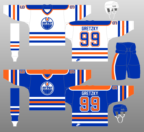
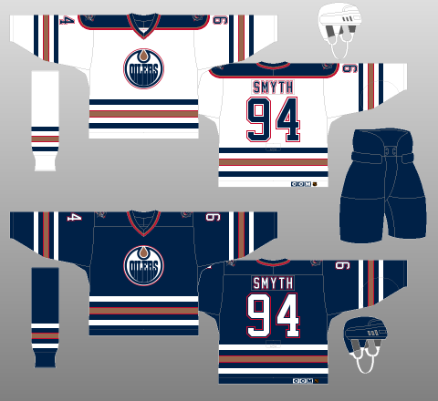
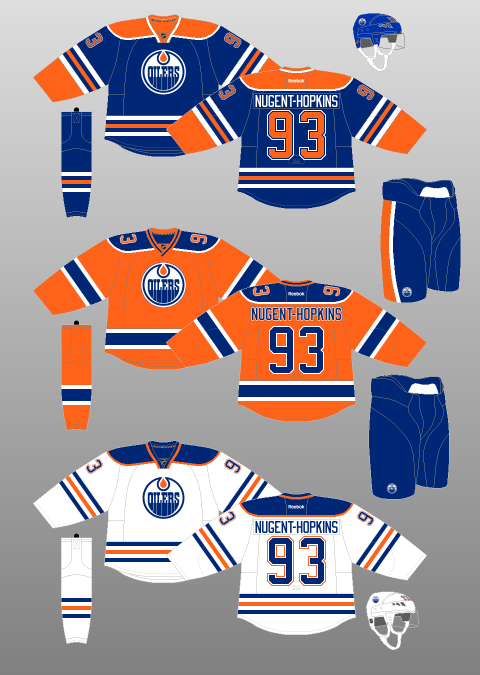
The first image in the top-left above is the Oilers’ classic design from most of the 80s and early 90s; it is a bright blue and orange, arranged in classic stripes-and-shoulder-yoke pattern. However, after an entire era of dynastic success wearing these design, the Oilers got swept up in the sports fashion trends of the 90s where bright colours were “gaudy”, and black, navy and muted accent colours ruled the day. Their first change, in 1996-97, was close to an exact duplicate of the originals, but in navy and copper (with barely visible red trim), with the white jersey being the only one that kept a shoulder yoke, but only for the first year, for some reason. This was not a bad look, with the striping still feeling like a hockey jersey, but the colour scheme was so much less lively (arguably, much like the team during the time they wore this!)
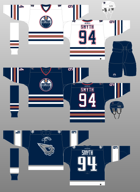
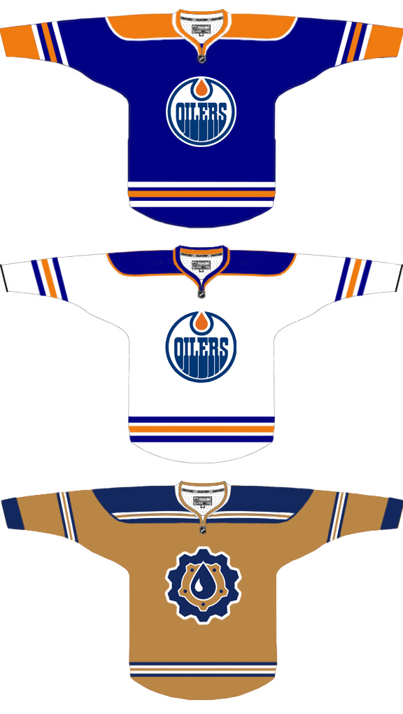
However, danger was on the horizon – when the Reebok Edge re-design arrived, the Oilers came forward with the design on the bottom-right, and it defies all reason. It literally looks like a practice jersey, with the stripes nearly all gone, the ones that remained stopping halfway across the elbows, for some reason, and the typical Reebok-style thin lines of piping from collar to waist, which unappealingly segment the jersey into vertical slabs. After this disaster of a rebrand, clearly both the organization and the fans were eager for something more classic and colourful.
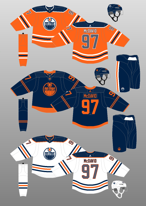
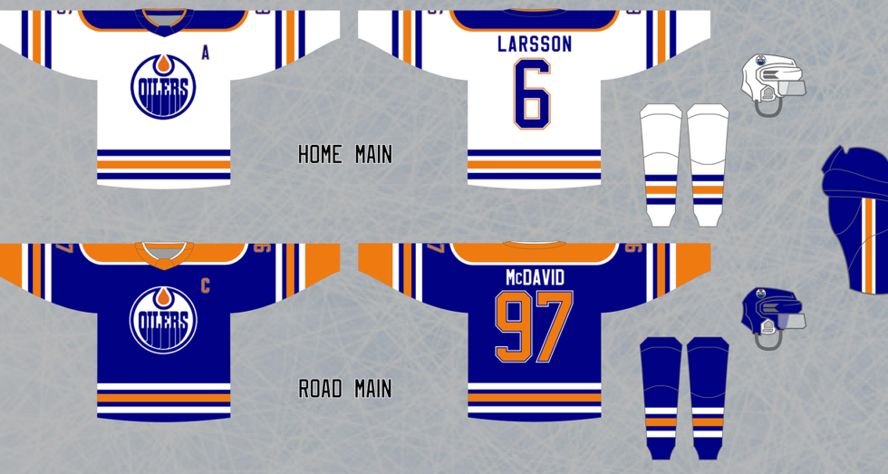
Luckily, just like the Islanders, they were able to reintroduce their classic jersey as a very popular alternate, and by 2011, this design had taken over as the primary home jersey with a matching white road jersey, putting the Reebok design behind them. Where the Oilers differ from the Islanders in a major way is the fact that once the Adidas takeover came to be in 2017, the Oilers changed things up again, instead of sticking with their traditional look, but it was mainly just a switch to orange as their primary home jersey colour, and the royal blue became navy blue again, which paired with bright orange, is a much nicer look. All that said, the orange primary jerseys feel odd for this team; they are so established as primarily blue in their branding over the years, I would say a return is in order, though not necessarily to a carbon copy of their original set.
Initial Home, Road and Alternate Jersey Re-design
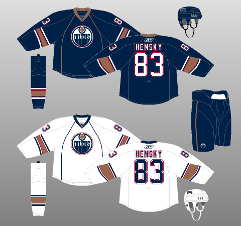
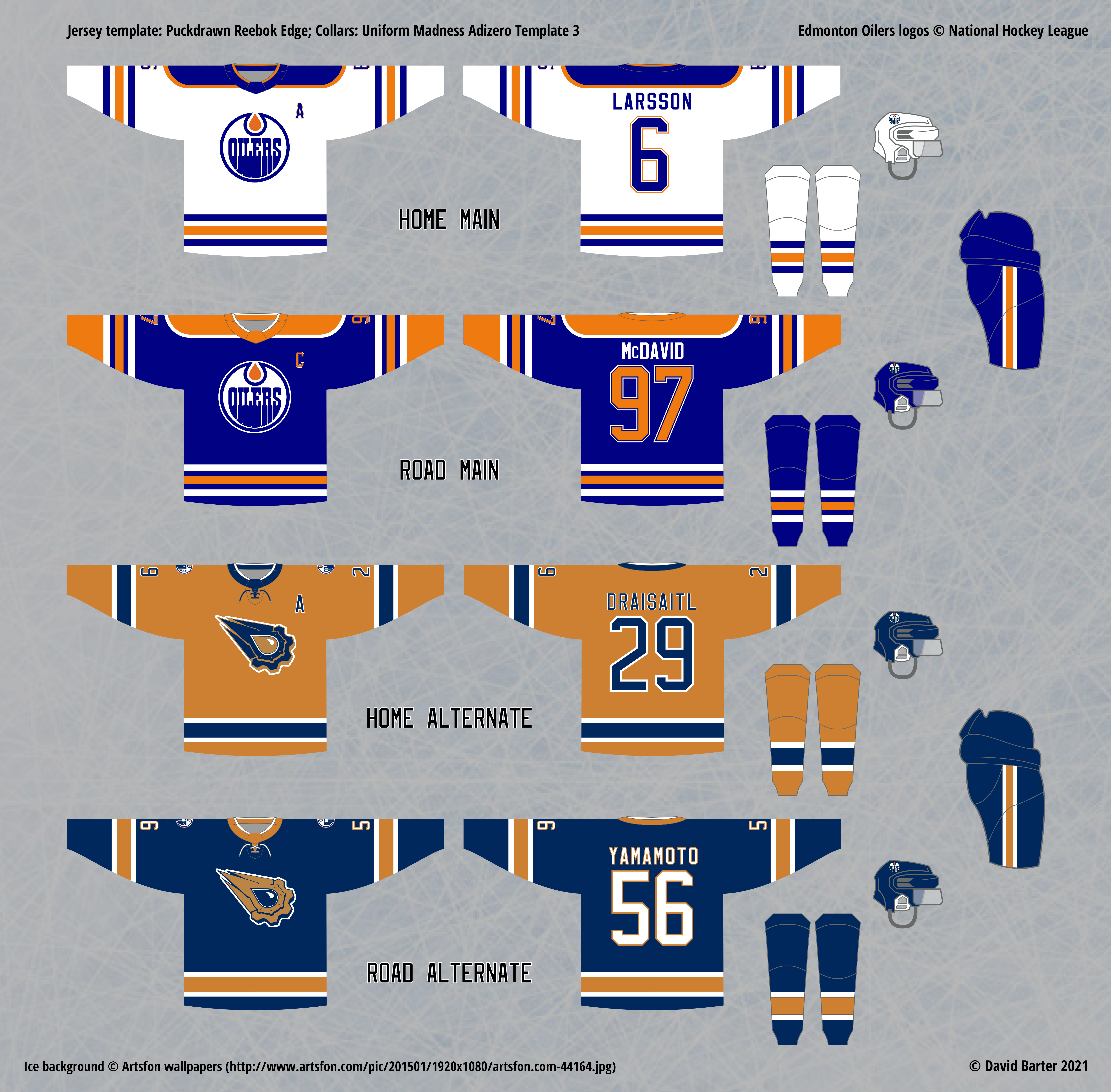
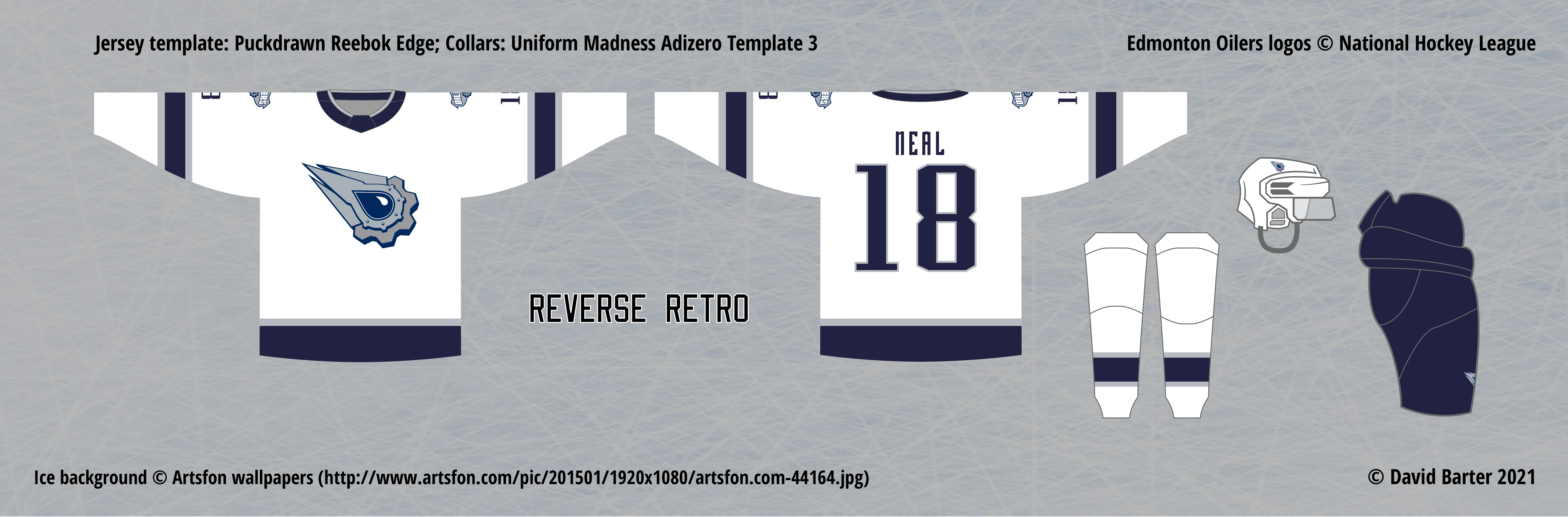
My take on the Oilers would be a return to the classic set; call it “if it ain’t broke, don’t fix it” if you must. However, as I was always determined to craft a suitable alternate set for every team, I found doing so for the Oilers very challenging. Their existing alternate concept are mostly a miss – only the Todd McFarlane oil-drop alternate looks any good at all, and even then, needs some tweaking (dropping the name and number font for starters…) – everything else, other than the “alternate” that returned them to their classic design, has been rather underwhelming, including their current alternate, which is a navy and orange jersey with no white on it, even in the logo, and very odd striping choices.
For my initial attempts at making an alternate, I was attracted to the idea of using the copper colour from their 90s rebrand as the base colour, since I remember the colour looking quite appealing. As you can see, it does not translate well to digital media, since it is a metallic colour that cannot be replicated on a screen. I tried many designs, but none stood out as a winner, including the one above, which is only “ok”, even taking the copper issue into account.
Eventually, I was able to find a satisfying design: the navy and copper combination is actually quite nice, and works well together, I just prefer brighter colours for the main set. As an alternate, this colour scheme offers a cooler, sleek look that contrasts the lively main set. Once again, the body colour of the road alternate is a bit of an issue – it looks rather ugly in digital form (I made it slightly more orange than the original colour), but in a real, physical jersey, I am confident this would look outstanding if the metallic effect is achieved (that would probably make the jersey prohibitively expensive, but it’s nice to dream).
The Reverse Retro concept leaves me with few options: the Oilers happen to be a team that has already explored “reversing” a classic set recently, so their original blue set is off the table, Their actual Reverse Retro jersey uses the white version of their classic set as a base, but flips the orange and blue around in everything but the logo. It’s a bit of an odd look, especially with the orange “reversed” pants, but it isn’t awful. However, my preference would be to revisit the Todd McFarlane alternate jersey, and simply make a white version. It’s not ideal, but this is the best option, I believe.