Los Angeles Kings: NHL Jersey Re-Design
By admin
Posted in - Hockey on May 28th, 2021
Los Angeles Kings: Brand / Jersey Design History
The Los Angeles Kings are an NHL franchise that has had a difficult time establishing a long-term, consistent brand identity, but at the same time, they have had multiple jersey and logo designs that are considered all-time classics, while some other franchises do not have a single one. Their original set of jerseys from the foundation of the franchise in 1967 is often said to have “copied” be Los Angeles Lakers’ iconic purple (“forum blue”) and gold colour scheme, but the Kings’ and Lakers’ colours were founded nearly simultaneously by virtue of being owned by the same person (Jack Kent Cooke), who had a preference for this colour combination.
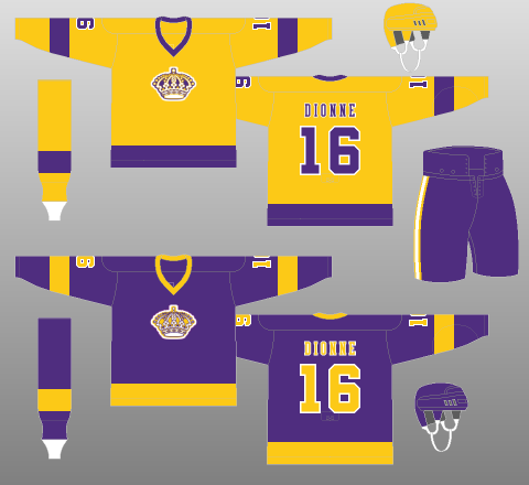
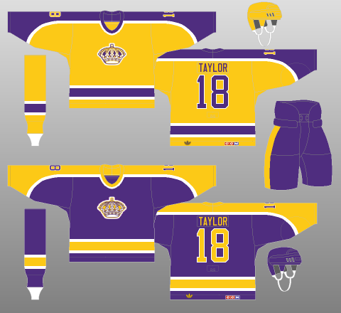
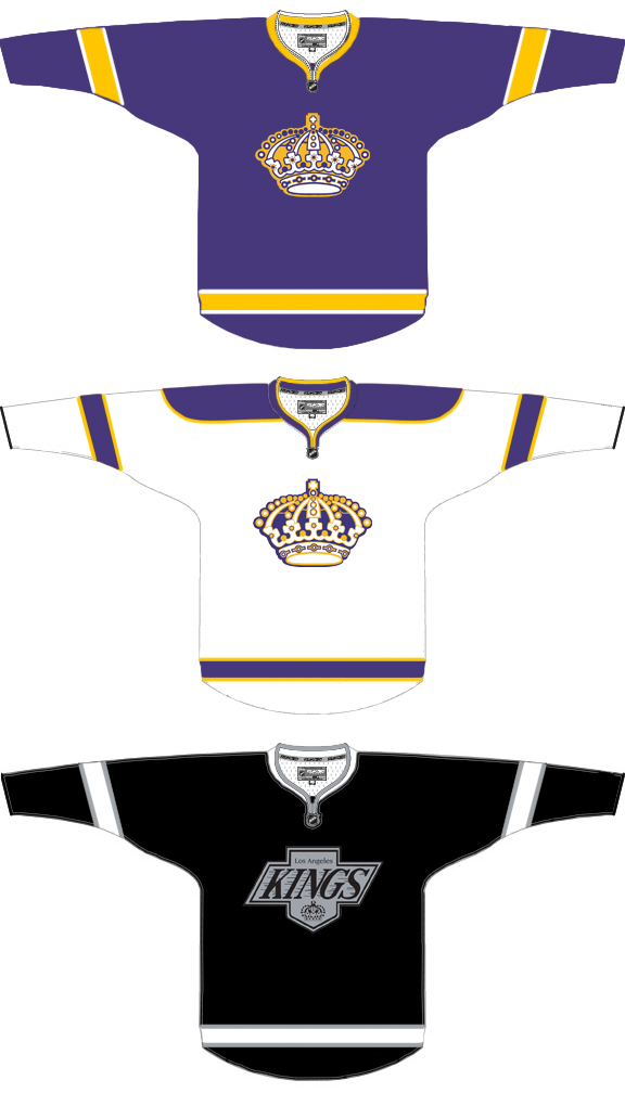
For nearly two decades, the Kings were unique in the NHL as a team that did not wear any white jerseys at all, instead using gold at home and purple on the road. Their simple jersey design from 1967 featured a single thick contrasting stripe on the elbows and waist, but in 1980, they updated their design to one that balances the colours better with shoulder-to-wrist shoulder yokes, and introduces white trim on the waist stripes. They did not keep this design for long, and shortly after introducing it, the Flyers changed their set to a similar design that they kept all the way to the Reebok re-designs.
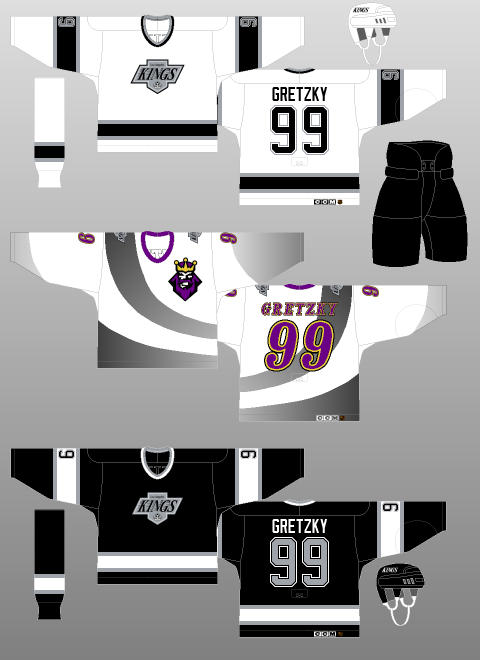
Coinciding with the arrival of Wayne Gretzky in 1988, the Kings switched their colours to black, silver and white, and introduced a new, very Chevrolet-esque logo. This was a very popular design throughout the late 80s and early 90s, but eventually, the need to change things up came around again, starting with the infamous “Burger King” jersey (white jersey with a gradient and small logo in the top-right of the jersey, seen in the top-right image above), their entry into the initial set of 3rd jerseys alongside the Penguins, Canucks, Ducks, and Bruins. I question the sanity of any of the designers of these five monstrosities, but this one in particular was just so random, off-brand and, well… bad (my opinion, obviously, but it is shared by many).
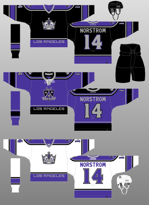
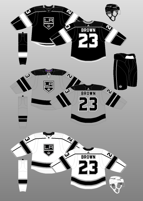
While this design did not last, it was a sign of change: starting in 1998, their jersey set and logo were redesigned to a black, purple and silver combo, and their logo to a shield with several ornate symbols on it, which was flipped in 2002 for their alternate logo that appeared the year after the rebrand. These jerseys features were fairly bland, despite having more colour than the black and silver set, and all of them featured a clunky “LOS ANGELES” in block font at the waist. Upon the Reebok Edge re-design in 2007, they kept the basics of this design, but dropped the waist stripe (but not the text).
A year after the switch to Reebok, some new influence from different figures in management brought forth an alternate jersey and logo based on the late 80s/90s black and silver look, and the design was extremely popular. While it was less clean and simple (piping running from shoulder to wrist passing over elbow stripes, for some reason), and had an awful, awkward font, it took over as the home jersey in 2011, had a white version (with better waist stripes) made to be the new road set, and was the jersey the Kings wore as Stanley Cup Champions in 2012 and 2014. Since then, they have mostly dropped purple, outside of a few special event jerseys, and have introduced a couple of silver alternate jerseys, including one to celebrate their 50th anniversary.
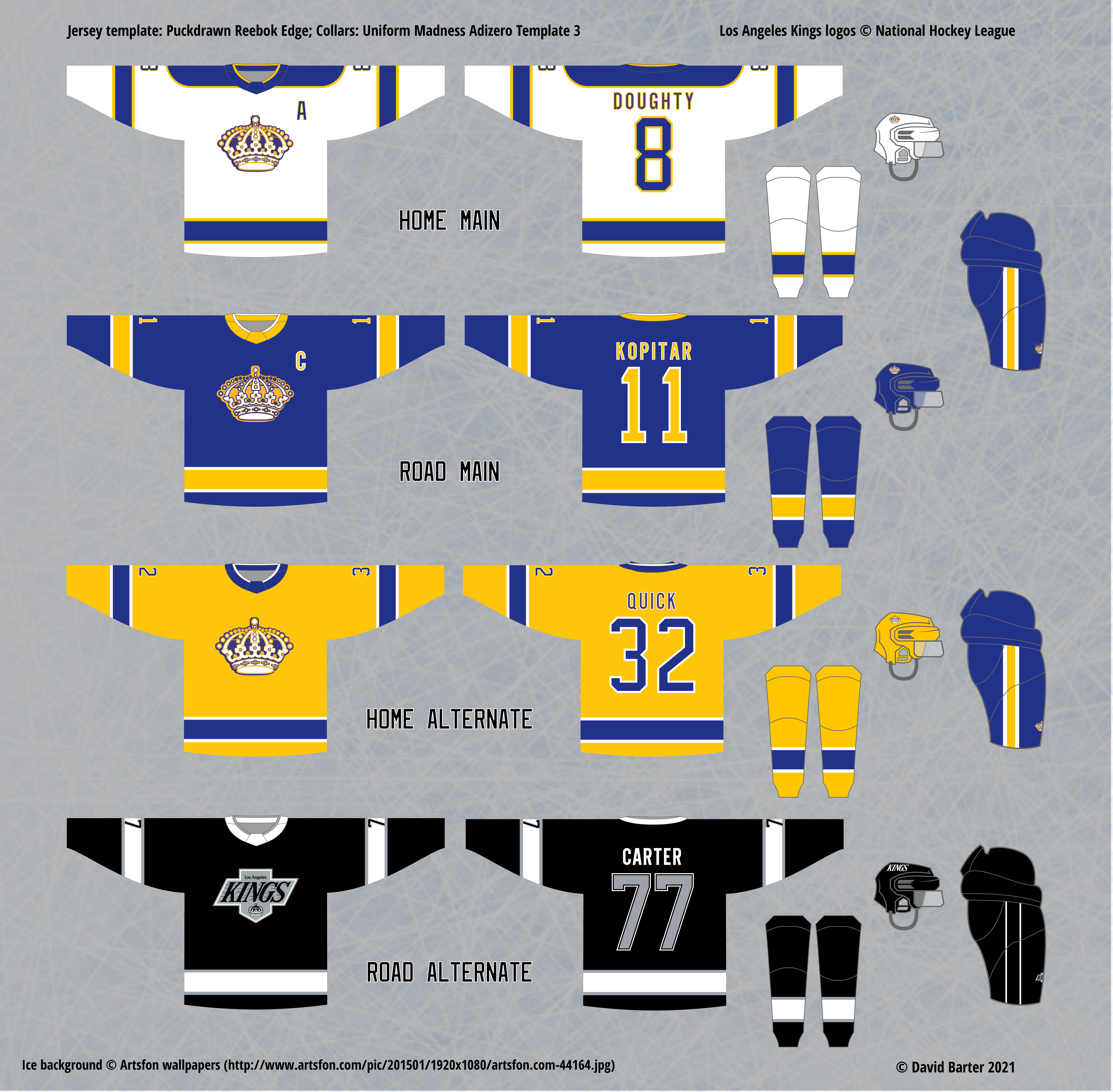
Initial Home, Road and Alternate Jersey Re-design
For my Kings designs, I took the simple approach of “why not both?” They have two main threads of jersey design and colour scheme, and both are extremely popular, so considering the possible inclusion of an alternate set, the only reason not to have both looks as part of the brand is simply consistency. Normally I prefer to be consistent between the main and alternate jersey sets, but in this case, I was willing to make an exception, even though I am not a huge fan of the late 80s/90s Kings logo (too much wordmark, not enough crown!) Other logos in the Kings’ history do not mesh with this design, so I stuck with the original.
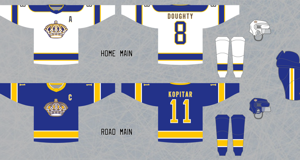
For the main set, I also decided to change up one element that I am not a fan of from their original designs. Instead of having the home jersey be gold instead of white, I designed a simple matching white jersey to pair with the purple one. I also added white trim around the gold stripes on the Road jersey, which was not a feature of the original jersey set, but helps the look quite a bit, in my opinion.
For the final design, when I decided to go the full alternate set route (i.e. a “fourth jersey”), I decide to break one of my usual rules, and have the set not match; instead, the Home Alternate is more of a complement to the Home and Road set, allowing the Kings to roll out a gold jersey very similar to their original (plus the white trim, like in the Road Main), but less often than their Home Main. That is a suitable setup, in my opinion, as I believe the Home jerseys should always be white, but there are many opportunities to make nice light-coloured home jerseys for alternate sets. I also believe that it is not a significant loss to leave out the matching white version of the late 80s/90s Kings set.
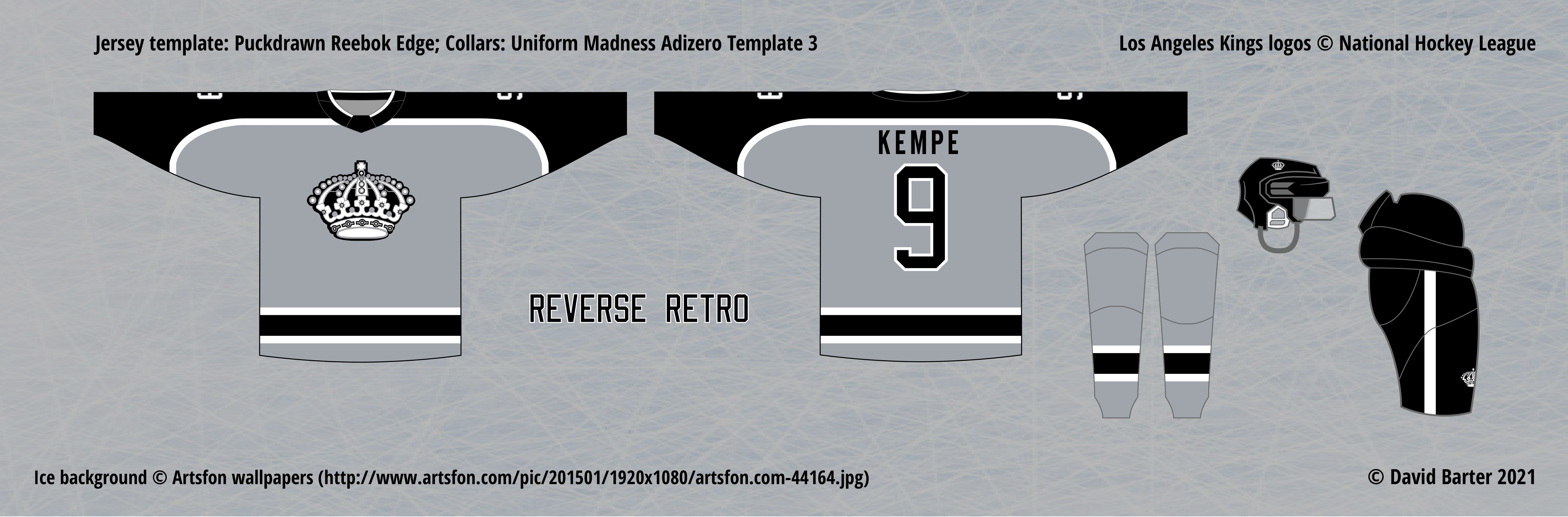
Now, here’s where things get controversial, if they haven’t already. When the real Reverse Retro set came out, the Kings’ jersey was almost universally praised as one of the best, combining the two different eras of jersey design and colours. I do not necessarily disagree with that sentiment (it’s a low bar!), however, all this design does it take almost the exact design of their original road jerseys, and put a much worse logo on it. It fits the Kings’ current set, but only because that set is so devoid of colour, which it should not be, so in the spirit of adding something to the team’s brand, I think it misses the mark, despite looking good.
My design complements the brand very well, also combining the two eras of jersey design and colours, but in opposition to the real design. It gives the Kings five jerseys that each have a different primary colour, and uses a very underrated past design that balances the primary and secondary colours extremely well (both in purple and gold, and here in silver and black).