Dallas Stars: NHL Jersey Re-Design
By admin
Posted in - Hockey on June 13th, 2021
Dallas Stars: Brand / Jersey Design History
Why discuss one NHL team’s jersey and logo history, when you can discuss two (kind of)?
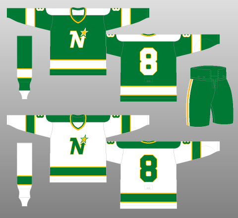
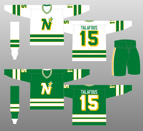
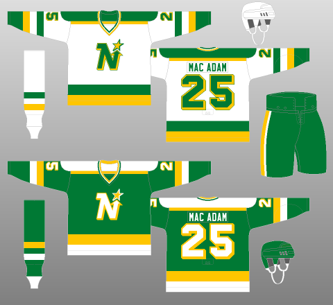
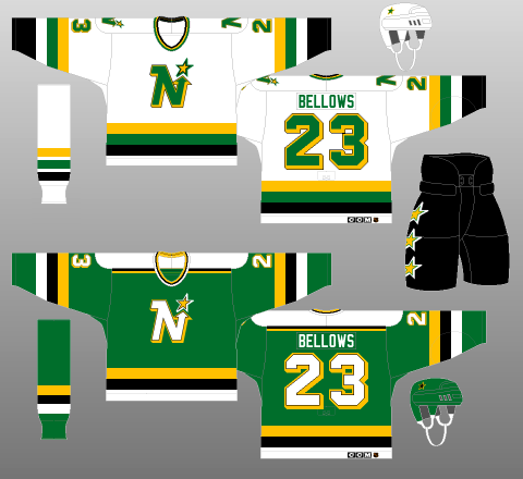
One of the biggest design crimes of the NHL, though mostly outside its control, was the death of the Minnesota North Stars brand. Between the name, the clever N-star logo, and certainly the lively bright green and gold colour scheme, this was a team with a classic look, through and through. Although it has been tweaked here and there throughout the years, and even added black to the colour scheme, which works surprisingly well in its minimal role, until 1991 introduced the distinctly “North”-less black design that was a precursor to the team’s move to Dallas.
Once the move occurred, the North Stars died, because the Dallas team decided to use “Stars” as their name, and a future NHL team in Minneapolis reviving the North Stars name would make games between those two teams rather confusing. The Dallas Stars even retained green as part of their colour scheme, which would have been an admirable decision to harken back to the franchise’s origins, were it not for the fact that doing so made it even less likely to see the green and gold North Stars return permanently.
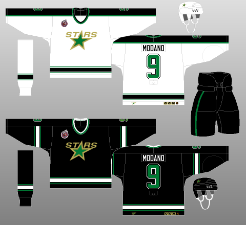
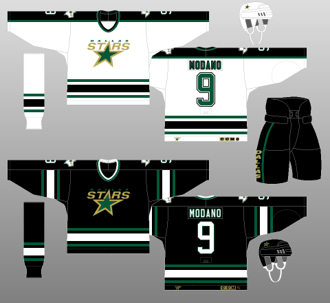
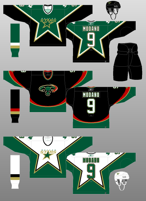
The original Dallas Stars uniform was very bland – mostly black, with a little bit of green in too dark a shade to stand out at all, and white. At the very least, this original design should have switched the green and black around to make the two colours easier to distinguish. Just prior to winning the Stanley Cup in 1999, Dallas introduced a dark green alternate jersey that used the star pattern design from the 1994-97 All Star Game in their colours, and this design proved popular enough to be worn during the 1999 playoffs, and was adopted as a full time set with a white version the next year.
Many Stars and NHL jersey enthusiasts consider this design a classic, and it might be, but I always found it ugly, and could not understand why – it seemed like a perfectly valid design, even though it was unconventional, but it did not sit well with me. In 2003, they introduced one of the most unfortunately designed alternate jerseys ever – it inexplicably brought in red as a colour for the Stars (a nod to the blue and red Texas flag, I guess?) and featured the bull-constellation logo that apparently no one noticed traces a very uterus-like pattern, hence the nickname “Mooterus”. Having a bull on a jersey for a team called the Stars would have been enough to throw this in the scrap pile, but that truly takes the cake!
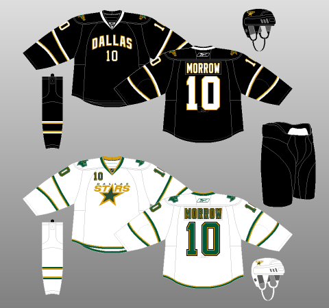
In 2007, the Reebok Edge re-design came, and I was optimistic for many teams, including Dallas, but the Stars’ Edge jersey set ended up being one of the worst in the league. I genuinely have no idea what the designers were thinking, unless they were thinking “we should make these jerseys look like basketball jerseys, because even though this team has been here for almost 15 years, the fans clearly only like basketball jerseys, not hockey jerseys!”, which is silly, but it would be some sort of rationale! This jersey set is even blander than the originals: it removes green completely from the black jersey, and both only have an extremely thin set of two pairs of stripes on the elbows to balance out the body colour (it does not succeed at doing this, at all). By 2011, the logo on the white jersey had been replaced by “DALLAS”, as on the black, and it would be another two years before the sweet salvation of the Victory Green rebrand would arrive.
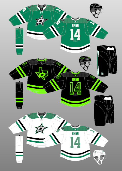
The Victory Green rebrand came with new ownership, and a re-emphasis that the Dallas Stars are green, not black. The Victory Green colour is a vibrant and lively change that immediately took Dallas from one of the worst jersey sets in the league, to one of the best and most recognizable. They also changed their logo, going away from the awkward, blocky “STARS” script over a star in green and gold, to the D-star logo, which feels much more “logo-like”, although the empty black space in the middle of the D is a bit strange. I found these jerseys to be a breath of fresh air, but I am hard to please when it comes to this subject, so naturally I found fault in them.
My issues with this jersey set are a matter of opinion – I don’t like how similar the design of the green jersey is to the Chicago Blackhawks’ red design, just swapping out the colour and one black stripe on the waist, and the design of the white jersey, while much more unique compared to other teams’ designs, feels a bit off in how it doesn’t quite match the style of the green jersey. Lastly, I much prefer the green and gold combo, rather than green and black; even though they contrast nicely, since the green is much brighter than the Stars older green, I still think going with more colour rather than less would be preferable. In 2021, the Stars introduced a black alternate jersey, and while it is an improvement over the Mooterus, the neon green just does not work on a jersey, and the Texas alternate logo should never be the front crest of a Stars jersey – it’s bold, but I would very much like to never see it on the ice again.
Initial Home, Road and Alternate Jersey Re-design
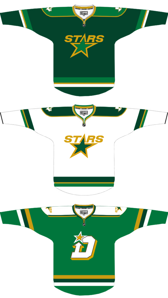
My first re-design of the Stars’ jerseys was to, as I alluded to, swapping the green and black of their original jersey set, though this did not help make it much less bland, and the colour scheme only really works on the Road Main jersey, not on the white Home Main jersey (the dark green shoulder-to-wrist yoke looks strange, so it has to stay black, with doesn’t match well when the other jersey in the set is primarily green). Eventually, I thought of the idea of scrapping black entirely, and bringing in the North Stars’ shade of green in addition to the dark green and gold.
I used this combo to mimic what the St. Louis Blues have done with their jersey set since the late 90s – using a dark and light shade of a single colour as the primary and secondary colours for the set, and balancing it out with a gold accent. For some reason, I stuck to the dark green as the primary colour instead of the lighter one, likely because I was still too attached to dark green as the Stars’ defining colour. The alternate is a full on North Stars throwback, so as to not completely waste the use of their green, and an excellent fan concept logo by Matthew Duke to give a Dallas spin on the North Stars’ look. This set is ok, but still lacks life or any kind of unique identity for the Stars.
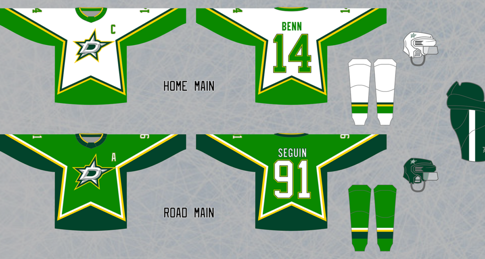
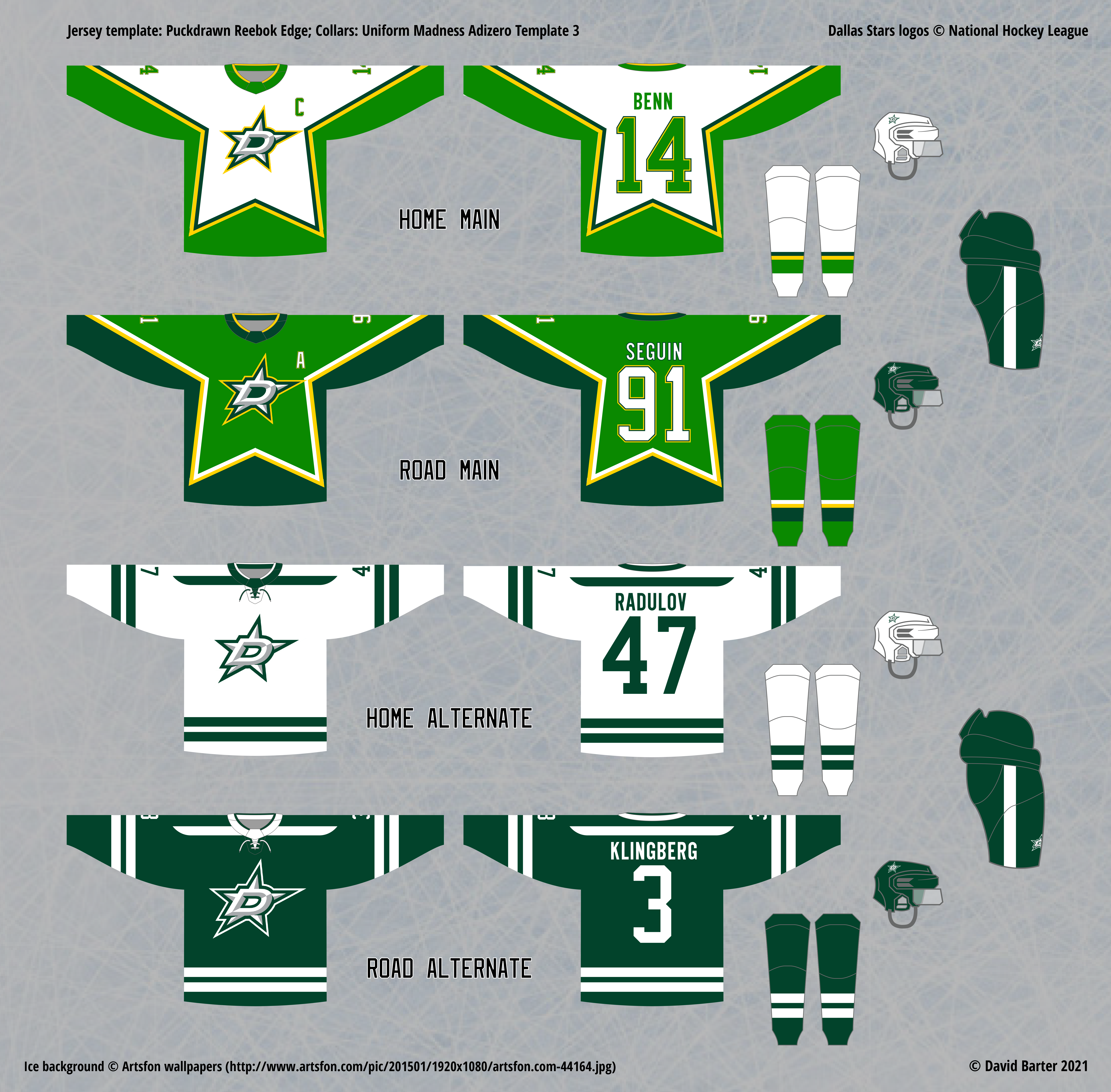
For as much as I disliked the star-pattern design that the Stars used in the early 2000s, or so I thought, I eventually got the idea of trying this design with a different colour combination. When the Stars rebranded in 2013 and started using Victory Green as their primary colour, this look clued me in to how much better they could look with a more vivid green in place of the dull darker green they had been using, and I had been sticking to in my concepts. So, I started flipping the greens around in my older design, which looked better, but still a bit too generic. Then, I randomly thought to try the star design with this colour scheme, and suddenly, the Dallas Stars visual identity you see above came to life, and it was unquestionably the best identity I had ever created for them.
By the time I did this, I had created the alternate set seen above as well, which I based off of the very nice Boston University Terriers’ design, and only used the dark green and white, to create a sleek, muted design reminiscent of what the Nashville Predators tried to do with their 2009 navy alternate. The two designs work well together, a contrast of uniqueness and personality in the main set with muted conventional design in the alternate.
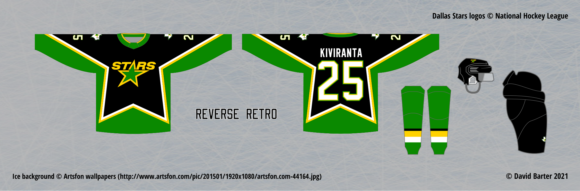
For the Reverse Retro set, the Stars would always face a dilemma, because all of their retro designs, except for the star design I am now having them use for their primary set, are very uninteresting, especially for a set of special jerseys that are supposed to be exciting. The only exceptions are from their days as the Minnesota North Stars, but that would obviously infringe on the Wild‘s plans, since they are in a similar situation as the Stars, with no good or exciting older jerseys from their current identity to draw on, only the team that preceded their own in their city, and is now in Dallas.
In the end, I went back to the star design here, and made a black version with a bright green bottom, to avoid the pitfalls of the original colour scheme for this design. The older Dallas Stars logo returns, with the green and gold matching the current colour scheme instead of the older one, which improves it as much as can be hoped for. It could have been worse…