NHL Jersey Re-Designs
My visions for the visual identity of all 32 NHL teams’ jerseys.
Although I am hardly an artist, I seem to have at least some level of creativity for NHL jersey design. I started this project as a way to express my ideas on jersey design (as well as share some other ideas I have come across), but also to keep myself practiced in Photoshop and Illustrator.
My gallery obeys a few specific rules that highlight my opinions on NHL jerseys:
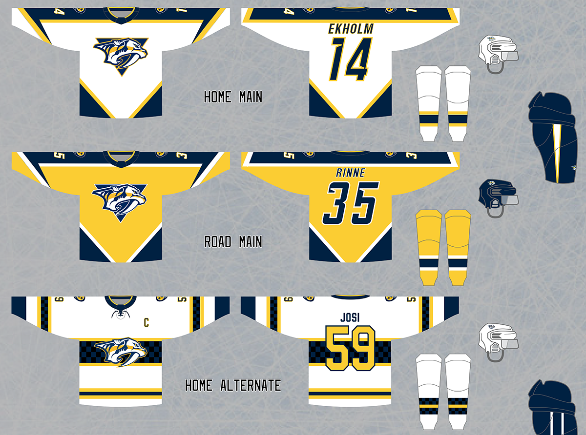
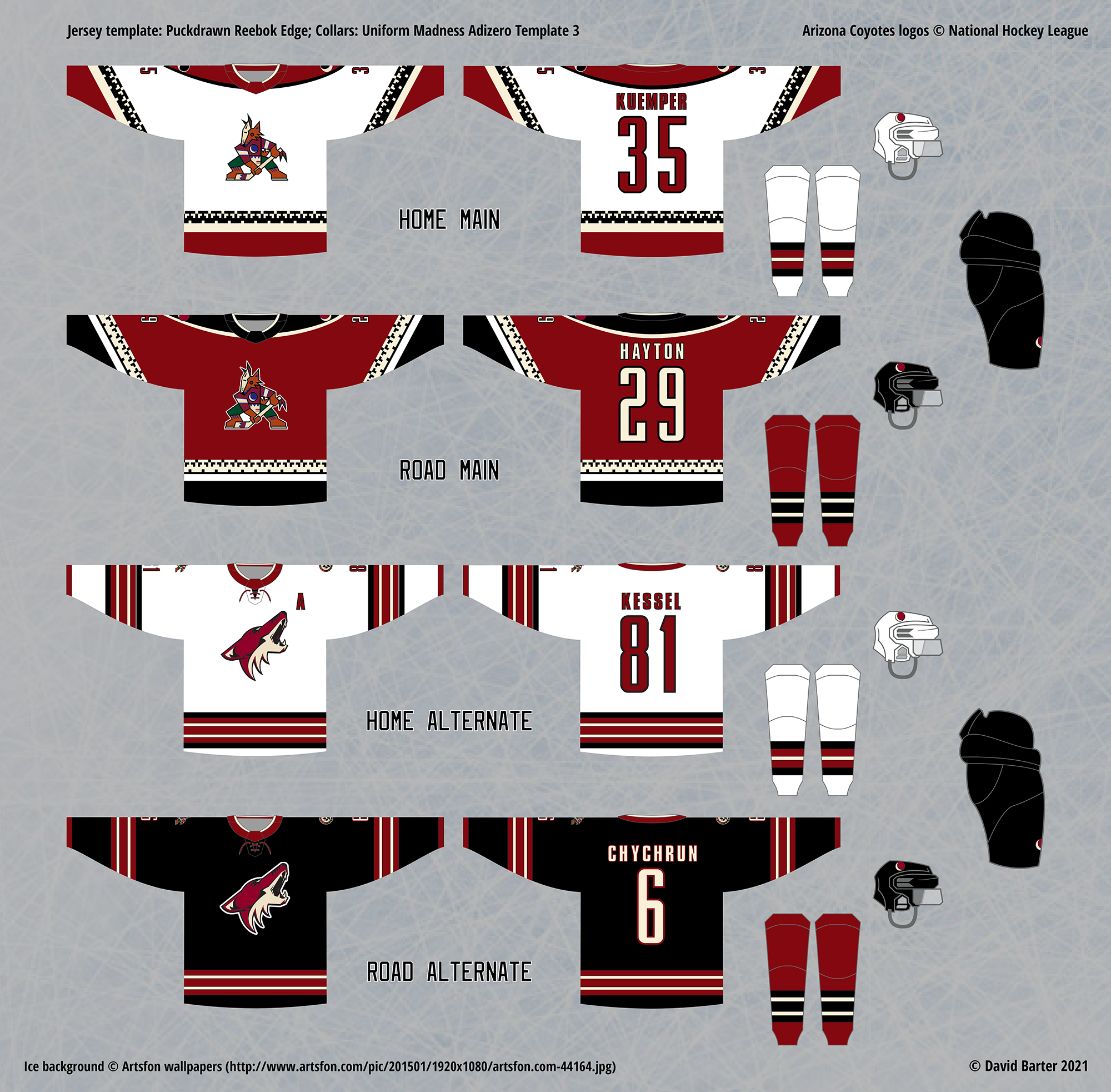
White jerseys are worn at home
There is a significant debate on this among fans of the game, since, with a few brief exceptions, white jerseys being worn at home was the standard in the NHL until the 2003-04 season. The change was made to accommodate the “third jersey” program – the trend (starting in 1996) of teams wearing alternate jerseys that provide a third option, alongside teams’ home and road jerseys. Since most third jerseys have a solid colour (not white), teams would often need to bring two sets of jerseys on road trips whenever they were scheduled to play a team who would be wearing their third jerseys, which was not very practical. So, white jerseys began to be worn on the road instead of at home.
While this makes sense, one problem is that under this standard, fans watching games in their home arenas only ever see their team’s solid colour jersey and the opponent’s white jersey, which is much more limited than getting to see the opponent’s solid colour jerseys (black, blue, red, Philadelphia’s orange, Nashville’s gold, San Jose’s teal, Colorado’s maroon, etc…) I believe that schedule makers can work out a sensible schedule to minimize the need to bring multiple jersey sets on the road in the “white-at-home” standard. I have also implemented a “fourth jersey” paradigm, where every team also has white (or simply light coloured) versions of their alternates that can be worn at home for most “third jersey nights”.
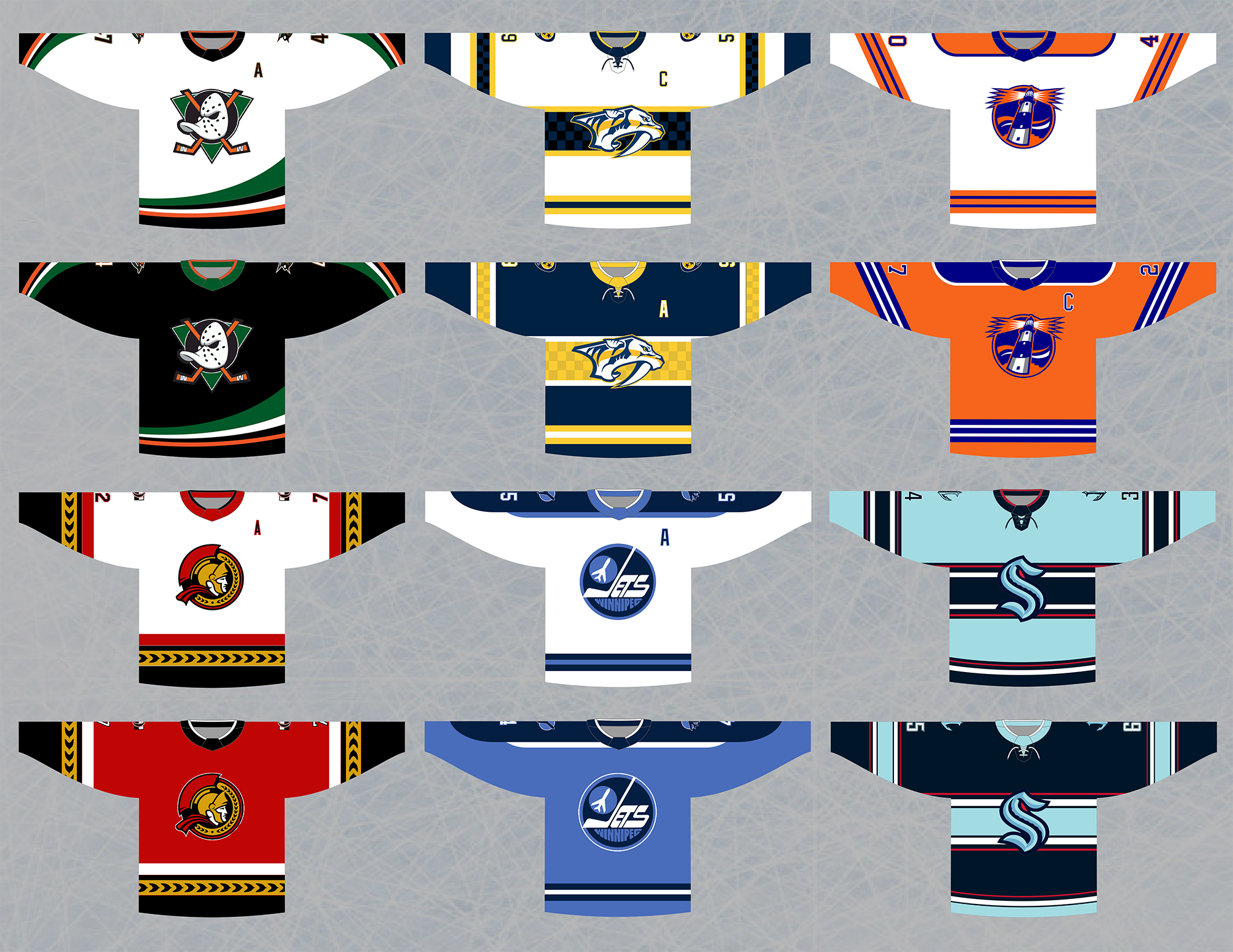
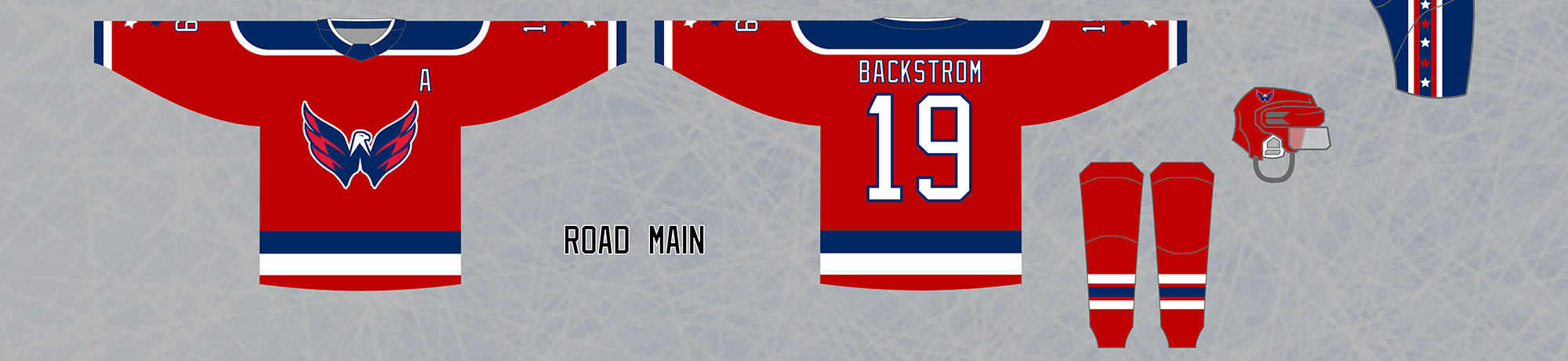
All teams have alternate home and road jersey sets
I decided to challenge myself by enforcing a home and road alternate jersey option for every team, even teams that have traditionally not had a “third jersey” at all (Montreal, New Jersey, Detroit, etc…) The result has been a few jerseys that feel rather redundant (New Jersey’s, Florida’s, Buffalo’s, for example), but others that look very nice and add to a team’s identity (Chicago’s, Ottawa’s, NY Islanders’).

This is a (mostly) wordmark-free zone
Although I am not a logo designer, I do have a passion for, and opinions on, logos. Where this is apparent in my designs is in the lack of wordmark logos: wordmarks are simply somewhat-stylized chunks of text standing in for logos, and I avoid them whenever possible. It is for this reason that I do not use the original or current Washington Capitals’ logo, or the wordmark used by the Anaheim Ducks when they changed their jersey designs in 2007. Where I draw the line is if the wordmark is heavily stylized into an iconic image (see: Montreal Canadiens, Boston Bruins, Calgary Flames, etc), or if it is simply a nicely-designed wordmark that appears only on an alternate jersey (see my Colorado Avalanche and Pittsburgh Penguins alternates).
One final note, this in regards to artistic merit – I am not at artist, and will not use this project to pretend to be one. My creativity in this area (the graphic design of jerseys) comes from the jersey designs themselves, but is almost entirely non-inclusive of logos. While I am passionate about NHL logos, I have almost no talent in creating logos myself. For this reason, it is very rare that you will see a non-existing NHL logo on any of my jerseys, but when I do use a fan-made logo, I credit the artist behind it on my gallery images.
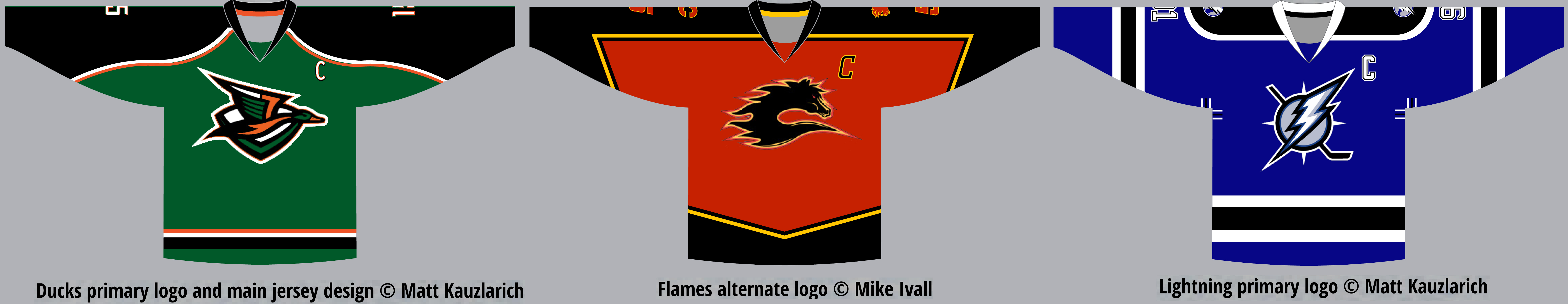
I do this because this project is not really meant to showcase my artistic skill with jerseys, it is meant to show my view on as close to an ideal brand for each team as possible. This is why some teams (Boston, Detroit, NY Rangers, etc) are almost identical to their existing jerseys or jerseys of the past, and also why I have featured the artwork of talented concept artists Matt Kauzlarich and Mike Ivall in my jersey designs – because upon seeing their designs, I decided that their work (or a slight tweak to their concepts) represented the best identity for a team that I could think of.
Jersey Design Details – Blog Posts
I have so much to say about every team’s branding, jersey history, and almost every jersey I have designed for this project, that I have begun to write separate blog posts for every team. These include the main and alternate sets, as well as the new Reverse Retro designs, which are based on the idea of the NHL’s actual Reverse Retro program, but most of my designs differ from the real ones. In fact, in one case, I made a team’s real Reverse Retro jersey into a main design in my set (Philadelphia).
I am also tweeting the images of my jersey designs, and linking each post there, and here. I felt it would be more interesting to post the images and blog writeups for teams in a random order, so the order of the posts is not organized by anything in particular. The posts are as follows:
- National Hockey League (Independent Hobby Project)
- ongoing
View More →